Designing the perfect box part 1: The cover
This article is the first in a short series focussing on how to design the perfect box.
The box cover is often one of the most overlooked parts of a board game and while many publishers will spend thousands on a beautiful piece of art, they fail to consider everything else that goes into creating the perfect box.
A box has 3 key roles for a board game:
- Protecting the contents
- Selling the game
- Looking good in someone’s home
For the purposes of this article, I want to focus on selling the game and looking good in someone’s home as this is where most people are going wrong.
Marketing vs Experience
You’ll notice a common trend in my articles where I prioritise experience over marketing. I believe providing the best experience for customers will lead to a greater success in the long run over quick wins from marketing, and I also think it’s the right thing to do.
With that said, there are arguments for both approaches and neither is wrong, while reading this article you will need to decide about which approach you want to take.
The box front
I believe the front of a box should be a piece of art, it should clearly show the name of the game and there should be nothing else.
My approach is to imagine I am designing a poster and creating something I would be happy to put it on my wall. By doing this you are increasing the chances the end customer will have the box on full display in their home and regularly be able to enjoy looking at it.
Additional features
Let’s look at other elements often included on the front of boxes.
- The publisher logo
- Credits (typically game designer / artist)
- Partner logos
- Awards
The publisher logo is about brand recognition, credits entice people to buy a designers next game, partner logos advertise special things you may find in the box, and awards tell you the game has been well received.
The question is, once you have purchased the game does any of this matter or are they all there to increase the chances you will pick the game up off a shelf and make the purchase. For me, these are marketing focussed and as such do not belong on the front of the box.
How to include them
If you decide you do need to include logos, credits, or awards on the front of the box then please consider these 2 things:
- Whatever you add to the front cover, blend them into the games art style and make them look like they were meant to go there. Don’t just stick a logo over a beautiful piece of art and leave it sticking out like a sore thumb.
- Consider if these things can be added via stickers to the shrink wrap of the game box. This way you can display as many logos and awards as you like over the cover of the box, but when someone has purchased and opened the game they will be removed.
The sides of the box
If you enter a retail store the odds are most games will be displayed sideways, and the same goes for people’s homes as well. It took me a while to realise, but the sides of a board game are just as important as the front of the box and should be carefully planned out.
Vertical and Horizontal
It is important to accommodate people storing your box both vertically and horizontally, meaning the top and bottom sides should be horizontal and the other 2 sides should be vertical.
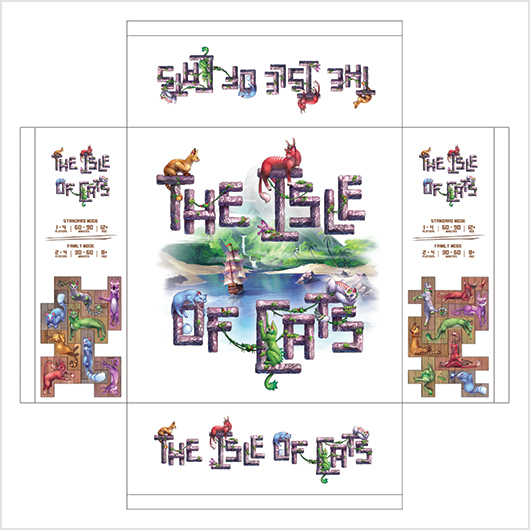
Here is an example from The Isle of Cats.
In doing so, whichever way the retailer and end customer display your box, it will be clearly readable and look like it was intended.
Here are a few examples from my shelf
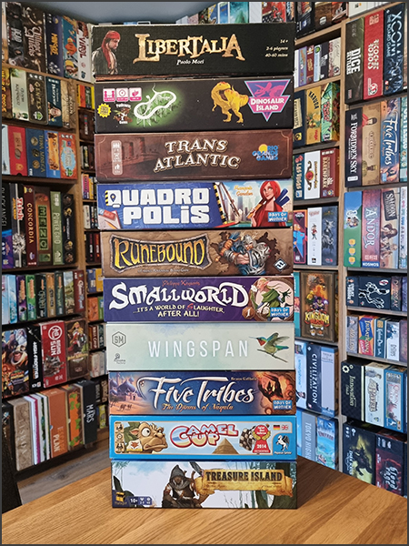
Notice how all the game names are clearly visible and the artwork has been designed to fit the horizontal look?
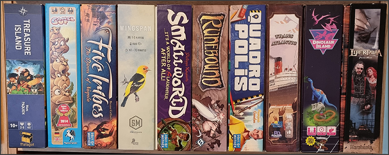
Yet, when we turn the boxes sideways, you’ll see 5 out of the 10 boxes suddenly don’t look so good. These publishers haven’t considered vertical storage, despite it being more common than horizontal storage in retail stores.
Key features to include
On the side of the box there are 3 key things to include:
- Artwork: To make it look nice
- The game name: So, people know what it is.
- Player info: The player count, age range, and play time.
The player info is important to include so people browsing games in a store and on their own shelves can quickly identify whether the game meets their gaming needs. These should be thematically incorporated into the box design to make them look like they belong on the box.
Additional features
The side of the box is a great place to include some of the additional features we mentioned earlier. While these still act as marketing tools to help sell the game, they don’t disrupt the main artwork on the box front.
The key difference to understand here is we want the front of the box to be beautiful enough that it will encourage people to display it face on. If the game is being displayed on it’s side, then the front cover has failed to achieve that and we’re now trying to still look good while providing additional information to tempt people to explore further.
This means placing publisher and partner logos on the side of the box is much more acceptable as long as they are blended into the artwork alongside the key features listed above. However, I do not think credits and awards should be on the side of the box as by including those along with company logos, artwork, the game name, and player information, you’ll start overloading the box. The goal of the side of the box is to still look good on the shelf, to provide key information, and to encourage people to pickup the box where they can find more information on the back.
Final thoughts
While designing the front of the box always consider the sales value and the customer value in everything you do. If something is better for selling the game than it is for the customer, then investigate temporary solutions. These could be stickers on shrink-wrap, or even a full game sleeve which can be discarded by the customer upon purchase.
Remember, whatever you choose to do make sure you blend everything into the artwork, so it doesn’t stick out, for example changing the colours of your logo to fit the box design is a great trick if your logo supports it.
I’ll talk about general box advice and the back of the box in articles soon, but until then I’d love to know what other tips you have for creating the perfect box cover.
Designing the perfect box part 2: The back is now available here.
Frank West
Frank West is a gamer and designer based in Bristol, UK. He published his first board game, The City of Kings, in 2018 and now works on other games and organising events in the local area. His goal? To design and publish games focusing on immersive themes, fun mechanics and beautiful components. If you have any questions or would just like a chat, feel free to get in touch at any time!
4 comments
Gabriel Giulian
9th February 2022 at 8:10 am
Good morning Frank 🙂
Thank you for the post, I’m slowly finishing up components and now thinking/designing the box.
I completely agree! The box needs to be well thought out in every aspect of the process. It matters for customers who bought your game and potential customers who’ll see it in a video behind a YouTuber or a board game store/cafe.
In my game, there is an exploration phase inside a Castle. My initial plan is to use the back of the box for it (Paris style).
Ps: The way that you used the box as a marketing/community building was brilliant!
Frank West
9th February 2022 at 10:58 am
Hi Gabriel, that sounds great! I’m intrigued to see how the back of the box will turn out and hope you let me know when it’s ready to see, good luck with designing the cover!
Sue Lueck Carlson
14th June 2024 at 11:28 pm
Thank you so much for the 2 game box articles. I am soon to be 75 and designed a Christian game. I was hoping my church would want it to offer to the congregation. I have no plans of selling it, but only wanted to help others know about the love of Jesus. I do have a 501 (c) 3 ministry, but I am not allowed to sell through there and I don’t want anything for making something that God helped me to do.
Are you available to email a few questions/concerns without them being posted? If not, I still want to thank you for all the information. I checked here in the USA to have only 10 boxes print, but it was so high that I can afford. I can get the 18″ x 18″ game board and box printed for about 1/4 the charge here in the states although I know the shipping will be high. They also said if they ship to the USA (where I am) there are no tariffs or customs… unsure if that’s correct or not.
Frank West
19th June 2024 at 3:08 pm
Hi Sue, I’m really glad to hear the articles have been useful!
I generally prefer questions to be asked in the comments so others can benefit from the answers, but my email can be found on the contact page if you’d prefer to not make something public.
Typically speaking, small production runs of 10 copies are going to be very expensive and it’s a choice between how homemade you want something vs how much you are willing to spend. Shipping from outside of the US into the US shouldn’t add any extra import fees if printing small batches in China for instance.
I hope this helps and wish you the best with your project!