Designing the perfect box part 2: The back
This article is the second in a short series focussing on how to design the perfect box, you can find part 1 here.
Congratulations!
Your box cover has done its job and has caught someone’s attention, they have picked up the game and now it’s time for the back of the box to make the sale.
The back of a box has 2 roles to play:
- Providing the right amount of information to sell itself.
- Providing all the legal text and required bits of information to get through customs and be sellable in a store.
The right amount of information
Here’s my list of what defines the right amount of information for the back of a box.
Game name
The game name and/or logo should be clearly written on the back of the box.
Summary
There should be a 1 – 2 line summary of the game to grab someone’s attention and encourage them to read further. This should be placed near the top of the box and stand out enough to make sure it gets read.
Game overview
Further down the box there should be a longer overview, ideally this will be 1 – 2 paragraphs that include the theme and the gameplay. I like to start with a thematic intro telling the reader who / what they are in the game and follow it up by explaining the core gameplay decisions.
Solo mode
Solo modes are becoming more important each year and I like to include a small section focussing on the solo mode and give a brief description of what to expect from it.
Box contents
You need to include a full list of contents on the back of the box. This should be done in a way that is attractive and enticing to the reader, but also clear for customs purposes. Some countries may flag a game that does not have the box contents clearly written on it.
Player count / playtime / age
The player count, playtime, and age information is critical and should be clearly highlighted somewhere on the back of the box. Ideally these will be done graphically and stand out so they can easily be found.
Artwork / game setup
While we have a lot of text and information to place on the back of the box, it still needs to look great and there should always be a picture of the game set up with all the main components shown.
You can include other artwork if there is space (especially on larger boxes), but the setup is a must to give people a visual idea of how the game will look on their tables.
Other information
In addition to the above list you should include your publisher logo and any key credits.
If there are any unique parts of your game that are important for a potential customer to know they can be included as well, but do not go overboard. As an example, on The Isle of Cats box I have a section for the “family mode” which explains there is a second way of playing with children and less experienced gamers.
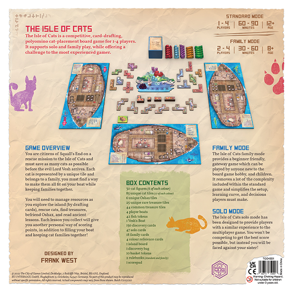
Notice on The Isle of Cats box I have the game name and summary at the top left, the key information top right, and a large setup graphic in the middle. At the bottom I use a styled box contents area to separate the game overview from the family and solo mode text. This gives them there own clearly defined space and makes it easier for a reader to find the information they want.
The required details
Everything above should be carefully crafted to look beautiful and make it easy for people to read. The required details below should be out of the way and not attract the readers eye. They are there because they are needed, not because they are going to sell more games.
Barcode
You must include a barcode on the back of your box for retailers to be able to sell the game, and fulfilment centres to be able to ship it.
Choking hazard warning
You should include the red 0-3 choking hazard icon, along with the appropriate warning text. I use:
“Warning. Choking Hazard. Not suitable for children under 3 years old.”
You must include the words “Choking Hazard” to avoid the risk of this being flagged at customs.
SKU
You should include a SKU (unique product code) by the barcode. SKUs can be anything you want, but they should be short, recognisable to your products, and easy to remember.
I use TCOK001 – TCOK099 for The City of Kings products, TCOK501 – TCOK599 for Vadoran Gardens products, TCOK601 – TCOK689 for The isle of Cats products and so on. This structure keeps all my products grouped under TCOK, keeps them short (only 3 digits long), and allows me to follow the same structure for each game I make.
Copyright / Trademarks
You should include the copyright symbol, the year of production, and your company name for copyright reasons.
“© 2022 The City of Games Limited”
If you have any trademarks you should use the appropriate messaging for the trademark.
Cover yourself
I also recommend covering yourself by including the following statement after the copyright information:
“No part of this product may be reproduced without specific permission. All rights reserved. Actual components may vary from those shown.“
Batch numbers
Each print should include a unique batch number, I use a number sequence of Year, Month, Print number. For example the latest print of The Isle of Cats is Batch #2112010. Year 21, month 12, print 010.
While this may not seem important, if there is ever an issue found with your game and it has to be recalled, having a batch number allows you to recall just the games from a specific print, and not every game ever made.
Made in
Somewhere you should state where the game is made i.e. Made in China.
You should also include the factory name and address if you want to cover yourself. Most of the time this isn’t needed, but for some countries such as Russia this is an important requirement.
Safety symbols
If your game is targeting an age range below 14, then you must have the appropriate lab tests done (speak with your factory). To show the tests have been completed, you will need to include the CE marking for games heading to the EU, and the UKCA marking for games heading to the UK.
Your addresses
If you are including the CE markings on your box you must include an EU address where you can be contacted.
If you are including the UKCA markings on your box you must include a UK address where you can be contacted.
In general, I would recommend including both addresses regardless of whether you have the safety markings or not, as they can help reduce questions at customs.
If you are based outside of the UK / EU, you should also include your registered business address on the box.
This step may seem scary, especially if you don’t have multiple offices (which most of us don’t) but there are plenty of options. For example, I use the warehouse addresses (with permission) where I store my games in the EU. You can speak with any partners (distributors, fulfilment centres, warehouses) and perhaps come to an arrangement.
Anything else?
Everything above covers the 2 roles I mentioned, selling the game and getting through customs to the store.
There is nothing else that you need to include, and I would argue further additions will have a negative impact for the most part.
If you must include partner logos, awards, or other materials then keep them blended to the box design.
I hope this helps you create a better back of the box experience!
Frank West
Frank West is a gamer and designer based in Bristol, UK. He published his first board game, The City of Kings, in 2018 and now works on other games and organising events in the local area. His goal? To design and publish games focusing on immersive themes, fun mechanics and beautiful components. If you have any questions or would just like a chat, feel free to get in touch at any time!
3 comments
Charles Hastey
6th June 2024 at 3:21 am
Hi Frank,
Not sure if you check this often. I found your article quite helpful. I’m developing a simple game and am currently working on the label and packaging. Can you explain to me the process of obtaining or creating barcode? Looks like based on your comments I can create my own SKU, but I’m puzzled with the barcode.
Thanks,
Charles
Frank West
6th June 2024 at 10:36 am
Hi Charles, I’m always reading comments and happy to help!
To confirm, you can create your own SKU, it is simply a made up code used for reference. I recommend trying to use something that is likely to be unique to you and easy to remember, although it is not required.
With barcodes the most important thing is to get them from a recognised source. There are many online services that resell barcodes and don’t correctly document them which can result in multiple people having the same code, which you want to avoid.
I get all of my barcodes directly from GS1.
The UK website is https://www.gs1uk.org/ and I believe they have other domains for many other countries.
I hope this helps.
Charles Hastey
20th June 2024 at 2:46 am
Frank,
Thank you so much for getting back to me and the suggestion. I have connected with GS1 and am in the process of obtaining a a barcode.