Creating the perfect Kickstarter page: My wireframe
A good Kickstarter page can be the difference between funding and failing, and all too often I see people rushing something together just before they launch. It always leaves me troubled to think a creator has spent the last 1, 2, or perhaps many more years working on a project only to rush a critical part right at the end.
Your Kickstarter page is your presentation to the customer, for most people it will be their introduction, and you should do everything you can to make your product look fantastic.
For most of my Kickstarters I’ll spend 2 – 4 weeks of full-time work designing and creating my page and writing all the text that goes with it. For my latest Kickstarter it took over 200 hours to get to a point where I was happy, but even I will admit it was a complex project!
The building blocks
For this article, I’m going to focus on the building blocks of a page and the order they should be presented. I’ll give rough suggestions for the specific content of each block, but I won’t go into details as each block could be an article in itself.
Equally, other topics such as reward levels, goals, and videos will be left for future articles so we can focus just on designing the page itself in this article. You can find all my crowdfunding lessons here.
The sections you need
A kickstarter page should be made up of clear sections of information, each section should have a title and ideally be visually separated from the following sections.
With The Isle of Cats I used textures from the game to give each block a different colour background.
Keep in mind, your project page is all on one long page on Kickstarter, you need to break it up to stop visitors from feeling lost and to avoid the feeling of endlessness as they scroll. Clear sections help achieve this while making the page look visually attractive.
Here are the sections your Kickstarter page should have, and the order they should be in:
- The introduction
- Inside the box (1 section per product)
- Stretch goals / reveals (only if you have them)
- Photos
- Pledge levels (only if you have more than 1 product)
- Addons (only if you have them)
- Group pledges
- Retailers
- Languages
- How to play
- Videos and quotes
- The team
- Avatars and media pack
- Where to find us
- Shipping and taxes
There are many ways to arrange a Kickstarter page but I believe the above approach to be a great standard to follow. It is based on a community first approach where you want to inform visitors of what the product is and let them decide whether it is something they want. Not only will it help sell games and reduce questions, but it will help build a positive community.
A second approach is to push the fear of missing out (FOMO), to heavily focus on prices, discounts, the exclusives and extras you get for backing right now, and to focus on the value rather than the information. This approach may get you more sales, but often comes with you having to promise more extras than you would like and a less positive community.
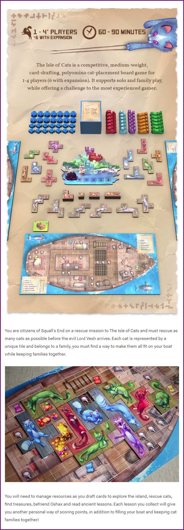
1. The introduction
The introduction should consist of 5 things:
- The player count, age rating, and length of play.
- An introduction made up of 1 – 3 sentences that clearly describe what the game is (your elevator pitch).
- A photo or render of the game setup from a top down perspective.
- 1 – 2 paragraphs that share the theme of the game with gameplay mechanisms thematically built in where possible.
- 1 really good photo or piece of art.
All of the text in this section needs to be incredibly well thought out, it needs to be descriptive, inviting and not too long – Sell your game!
Optionally, you can have 1 (longer) or 2 (shorter) quotes woven into this section. I prefer to use quotes that are both positive and descriptive rather than just “best game ever” as they help provide more information about the game while saying it’s good.
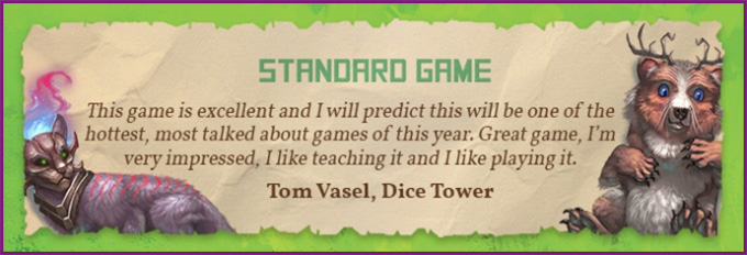
This is a perfect quote as not only does it make the game sound good, but it talks about it being enjoyable to teach which is a major hurdle for a lot of gamers.
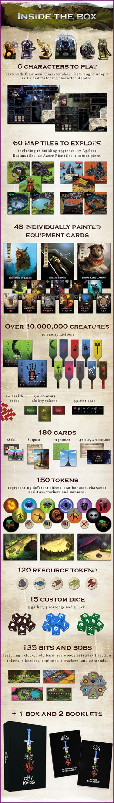
2. Inside the box
This section should be visually stunning, it’s your opportunity to show all the components and your best bits of art.
You should group components where it makes sense, especially the less visually impressive ones such as basic tokens and highlight the best bits.
You should clearly name each component type and specify how many of that component are in the box.
Your task is to make sure people who look at this section see:
- How beautiful the game looks.
- The value they are getting for their money, don’t make it look too small!
If you have multiple products, for example a game and an expansion, you should have 1 section for each key product. Don’t list small addons or accessories here, they can come later on.
Finally, if you only have 1 or 2 products and no addons, then you can include the individual prices on the bottom of the inside the box sections. Negating the need for sections 5 and 6 (pledge levels / addons). If you have 3 or more products and/or addons, then don’t include the prices here.
3. Stretch goals / reveals
If you choose to have stretch goals or use daily reveals, this is the best place to have them.
As visitors scroll the page it will organically continue the “inside the box” section by showing the extra stuff that will now be in the box due to the stretch goals unlocking.
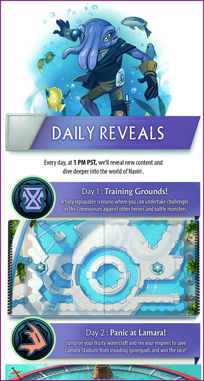
Example taken from Tidal Blades 2
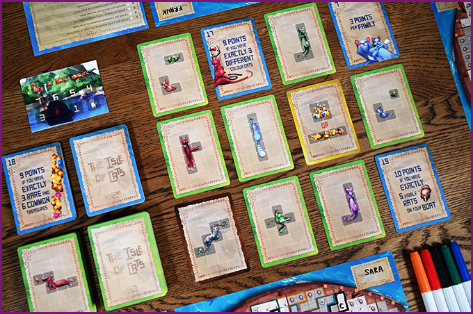
4. Photos
Great photos of your product won’t just sell your game, they will give potential backers confidence in your ability to make a great product.
It’s amazing how much seeing something real subconsciously changes your views of something, it becomes real rather than just renders and concept art.
You don’t need final versions of your product either, good prototypes do a great job as shown below.
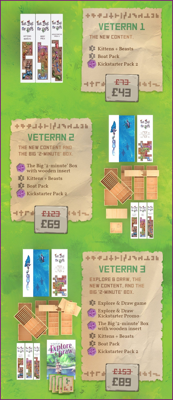
5. Pledge levels
You can read about my thoughts on pledge levels here.
If you have multiple products and are including a pledge level section, then you should show summaries of what’s included in each reward tier by showing each product, the price, and the name given to the reward option.
If you have additive pledge levels, meaning a basic one, then a deluxe, then an all-in, make sure you clearly state what extras are included in each one when compared to the last. It can be useful to included a comparison chart in these situations at the top of this section.
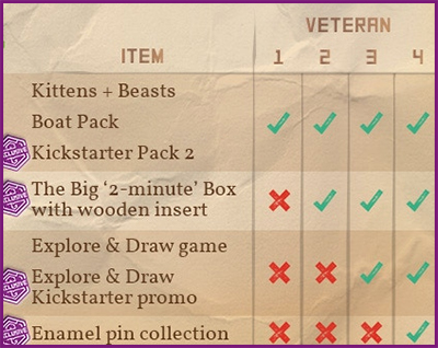
Don’t try to make each pledge level too big as you want people to be able to scroll and easily compare them. But at the same time, do try to make sure as the price increases, the amount of stuff also visually increases alongside it.
6. Addons
Addons work just like pledge levels but you want to provide a little more detail about what each addon is. Create a block with each addon available, include the price and describe what is included ideally in 1 – 2 sentences.
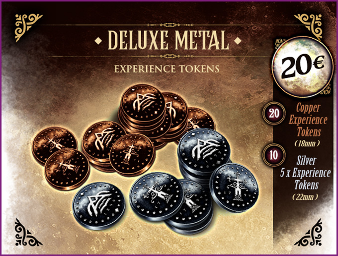
Example taken from The Dark Quarter
7. Group pledges
If you’ve never run a Kickstarter before then you may not be familiar with group pledges but if your Kickstarter is successful, it is very likely to come up.
Group pledges are when 2 or more people get together and want to buy multiple copies of your product for a discount.
You should always include a statement on group pledges, either stating what your group pledge offering is, or why you don’t offer it.
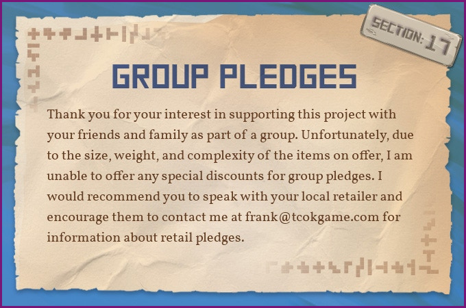
The idea here is to pre-empt frequently asked questions while showing potential backers that you have a full understanding of how Kickstarter works and the types of things people want to know.
While your page should look good, a big part of a successful Kickstarter is proving you’ve done the research and laying the foundations for strangers to trust you with their money.
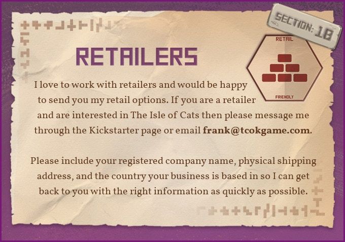
8. Retailers
Working with retailers is a great way to sell more copies of your game, increase your reach, and make the industry aware of your product.
You should include a statement on retailer options, either stating what your retailer process is, or why you don’t have one.
9. Languages
Personally, I leave translations until after Kickstarter but some people like to include them. You can learn about the translation process here and should always include a statement on whether or not they will be included in the campaign.
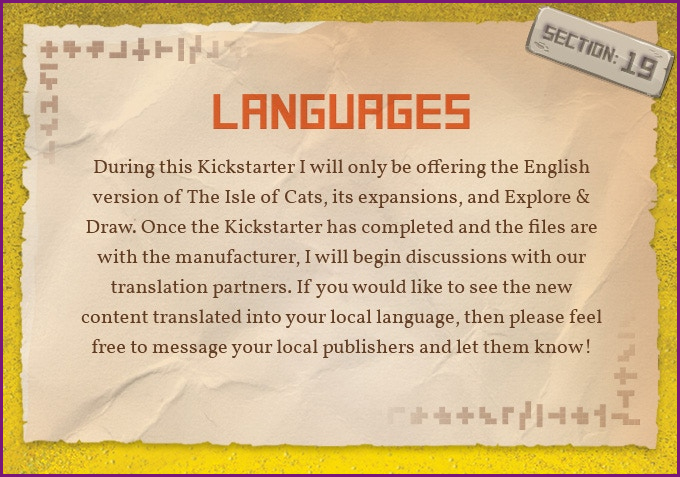
This is very likely going to be the most commonly asked question so again, show people you already know that and have an answer prepared and on your page!
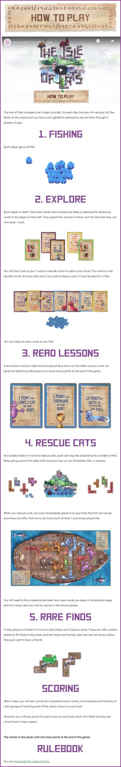
10. How to play
The how to play section is one of the hardest to write and I really recommend you testing your final how to play section on people not familiar with your game.
You want to write a summary of how the game plays that will give people an idea of what to expect, present them with the key mechanisms and decisions, without diving too deeply into specifics. You shouldn’t use any marketing speak here and should be entirely focussed on informing the reader.
Ideally you will create 3 – 7 animated gifs, give each one a title and place 1 – 2 sentences above each of them. This should take no more than 3 minutes for someone to read in full and should give them a good idea of how the game plays.
I recommend ordering this section as follows:
- How to play video.
- Your 3 – 7 gifs and descriptions.
- A link to the rulebook.
- Details on how the solo mode works if you have one.
It is absolutely critical that you have a rulebook available to download, even if it is just a draft (make sure it says it’s a draft). This is a big tick for first time creators and will only result in concern if it isn’t available.
Afterall, a game should be blind playtested before going on Kickstarter so the rulebook should exist!
11. Videos and quotes
This is where you should include all the videos that have been created for your game.
I like to wrap them with quotes taken from the creators and I’ll also link to podcasts and written reviews should any exist.
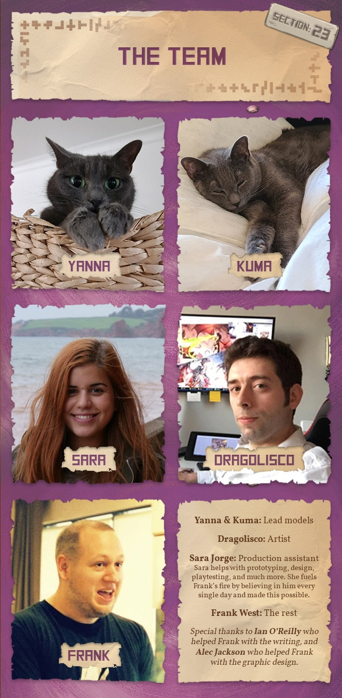
12. The team
People like to know who they are supporting and creating a team section is a great way to help them learn. It doesn’t matter if you’re just one person or a team of people, you should include a section about who is involved in the project.
You can also include any partners here such as your chosen manufacturers and fulfilment centres. This can further help people have confidence that you’ve already done your research and chosen partners to work with.
Have some fun with this section, show your personality and don’t be afraid to be creative!
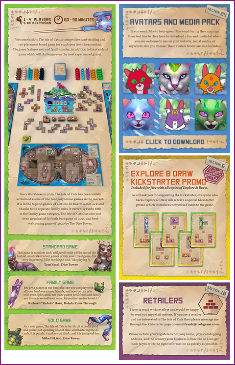
13. Avatars and media pack
Media like to cover games and by providing downloadable photos and assets you can make sure they use the best artwork possible to represent your game.
Likewise, your biggest fans and loyal supporters like to help in anyway possible so providing avatars for them to use is a nice little extra. I’m always amazed by how often I see my avatars being used all over the web and it’s a great way to build community while organically marketing your product.
I typically create a public folder on Google Drive and point people to it in this section, while sharing a preview of some of the images on the page so people can see what they are getting.
![]()
14. Where to find us
Listing your social media accounts, website, and any communities that may be formed around your game is a great way to get people to get involved outside of the Kickstarter.
Anyone who’s gotten this far on your page is going to be either really engaged or still looking for answers and directing them at places they can learn more and interact with you is perfect for both groups of people.
It doesn’t need to be a big section, but do provide a nice list of the places you can be found along with links.

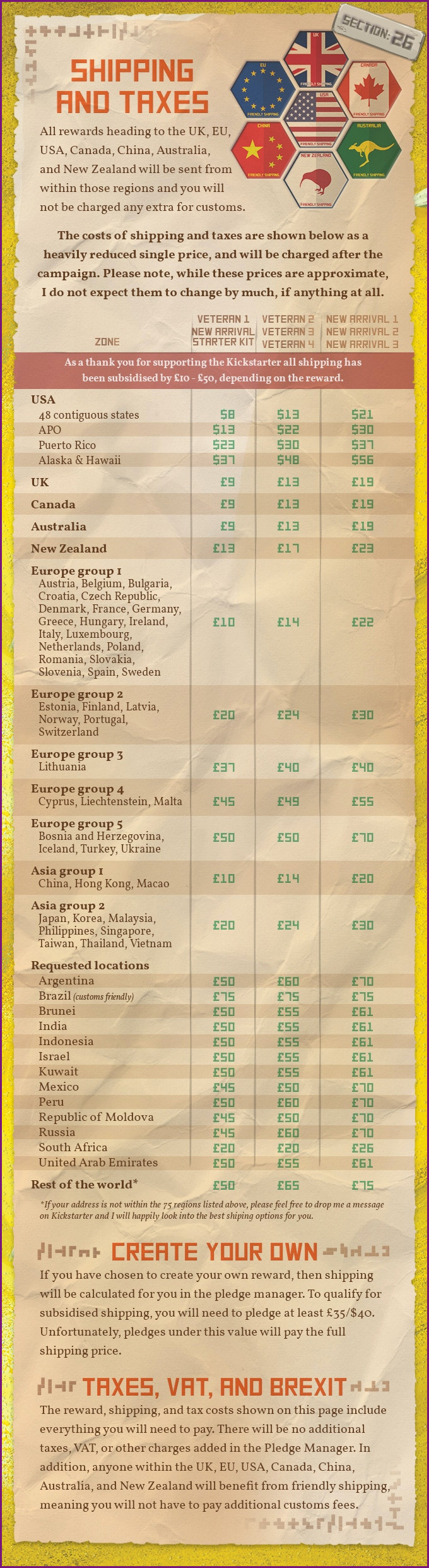
15. Shipping and taxes
Finally, you need to make sure you include a section that covers your shipping and tax rules.
This should include:
- When shipping will be paid.
- How much will be paid or estimates.
- How taxes will be handled.
- Which countries you are providing customs friendly shipping for.
It may seem strange to include this as the bottom of the page but I recommend doing so for several reasons:
- It’s the most off-putting part of a Kickstarter for many people, no one likes to pay for shipping or taxes! By putting it at the end, you can make sure everyone has all the information they need before they get into the less fun stuff.
- You can easily direct people to it by saying “at the bottom of the page”, which is much easier than saying it’s about 3/5 of the way down.
Section numbers
I’m a big fan of numbering the sections on my page and clearly showing readers the numbers.
Why?
Here are some examples:
- In the comments you can answer questions by pointing people at section 7.
- If your pledge descriptions, you can say shipping information can be found in section 14.
- In your inside the box section you can tell people they can find full rules in section 11.
It makes it very easy to point people at things and while Kickstarter only offers 1 page campaign pages I’ll always be doing this moving forward.
Closing thoughts
It’s not possible to have a one size fits all page but if you do follow the above steps you’ll be in a fantastic place.
It is a lot of work but take it one section at a time and start working through them, if you get stuck then browse Kickstarter, look at some campaigns and see how they approach each section.
Don’t be afraid to get creative and try your own things, you do need to stand out but if your game is good, a great looking page with all the required sections will tick enough boxes to succeed.
Good luck!
Frank West
Frank West is a gamer and designer based in Bristol, UK. He published his first board game, The City of Kings, in 2018 and now works on other games and organising events in the local area. His goal? To design and publish games focusing on immersive themes, fun mechanics and beautiful components. If you have any questions or would just like a chat, feel free to get in touch at any time!
2 comments
Tom
3rd May 2022 at 7:29 pm
Frank – this is so so so so SO helpful! Thank you for such a clear and concise breakdown of how to lay out a campaign page. Your blog has become my go-to for all KS prep queries!
Frank West
3rd May 2022 at 7:38 pm
I’m really glad to hear it and wish you the best with your campaign!