Creating a recognisable brand
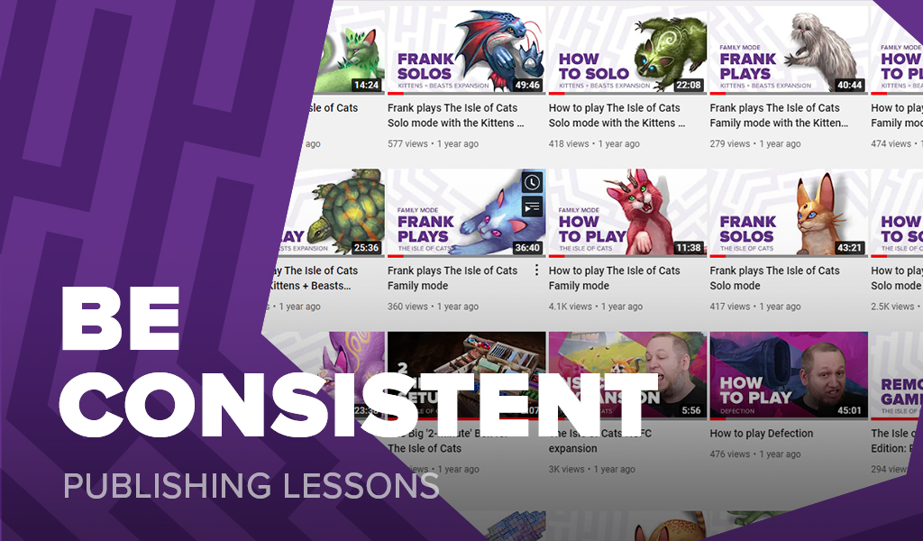
A few months ago I wrote an article about finding your voice, encouraging people to think about how they say things when speaking for their company. Today I’d like to discuss visual representation and talk about creating a recognizable brand.
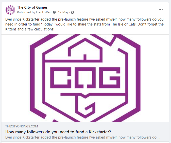
For those of you who follow me, you’ll have noticed every article I share from this blog comes with the same thumbnail.
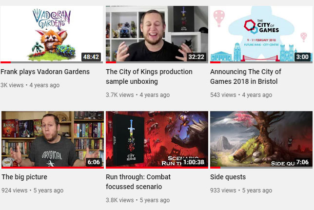
In addition, every video I upload to YouTube has one of a dozen different unrelated thumbnail styles.
When it comes to announcements, I don’t have a standard way of presenting them, but a recent one looked like this.
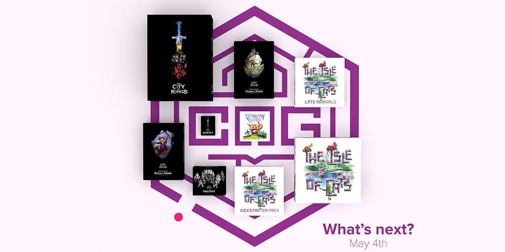
I’ve certainly tried hard to keep something recognizable in the thumbnail, typically being the COG logo, a photo of me, or a box cover, but each element has been approached on a when needed basis without considering cross-channel communication.
This was a mistake given most of what I do gets shared across multiple platforms and I’m just making it harder for people to recognize my content.
A new approach
Last month I spent some time reviewing this problem and created a series of thumbnails that can be used in different situations but have enough overlap to feel connected.
The basic thumbnail is a text only graphic that has a rotatable COG maze to fit the title. This will be the default thumbnail for when I want something official looking, moving forward.

When I want to keep an official feel but look a little more fun and inviting, I’ll be switching to the part maze, part graphic thumbnail which is my go-to for this blog.

These two graphics are both great choices for content that originates on my website but for YouTube I wanted something more creative.
The more formal videos presented from The City of Games, such as how to plays and overviews will use a light or dark background image. There will be a focus on a single object in the graphic, while using the maze, title, and subtitle to connect back to the website thumbnail style.
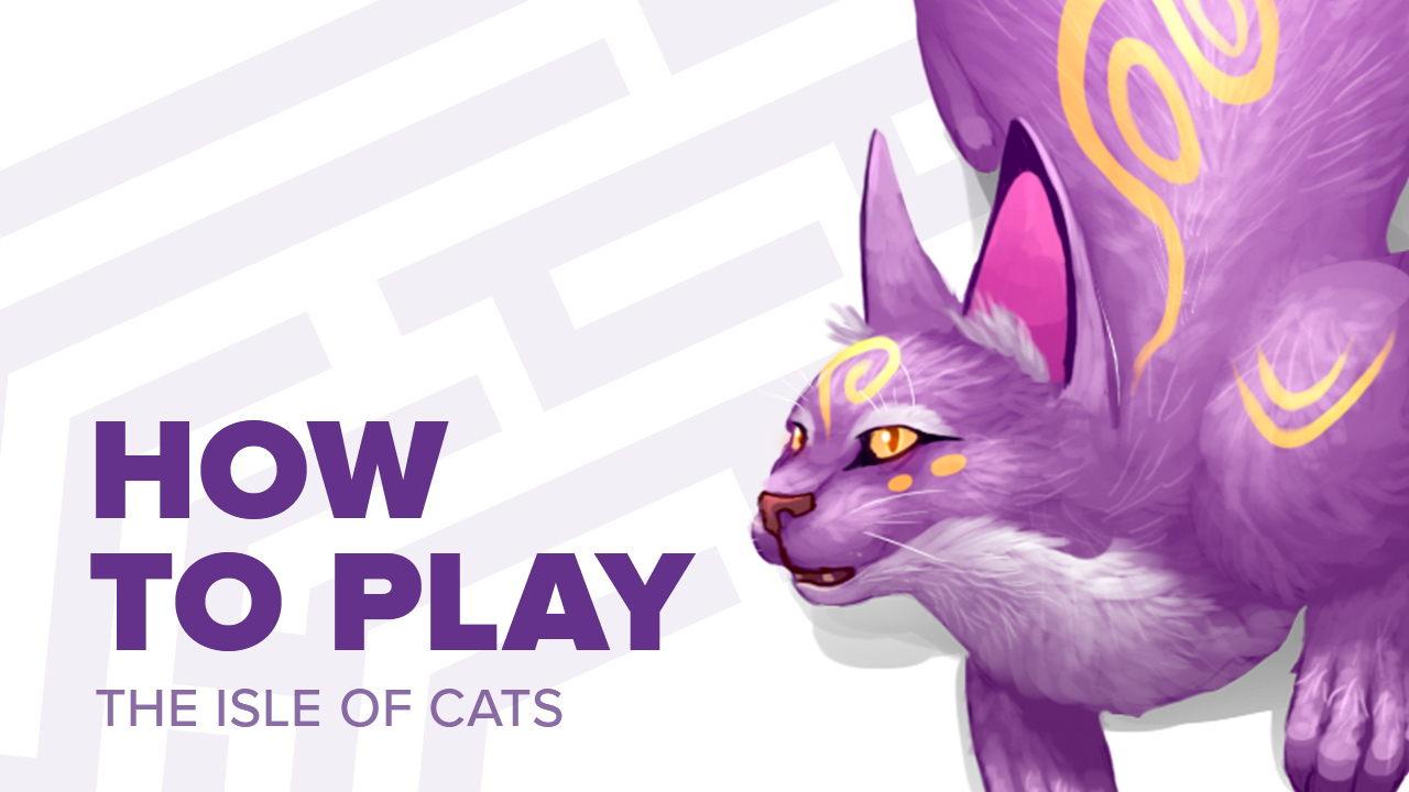
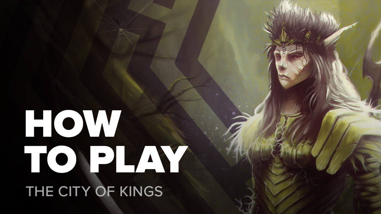
Finally, for when I want to break further away from The City of Games and release “Frank videos”, there’s the quirkier style. The title and subtitle remain consistent, but the maze is enlarged to frame the image and my head sits between 2 lines to add some depth.
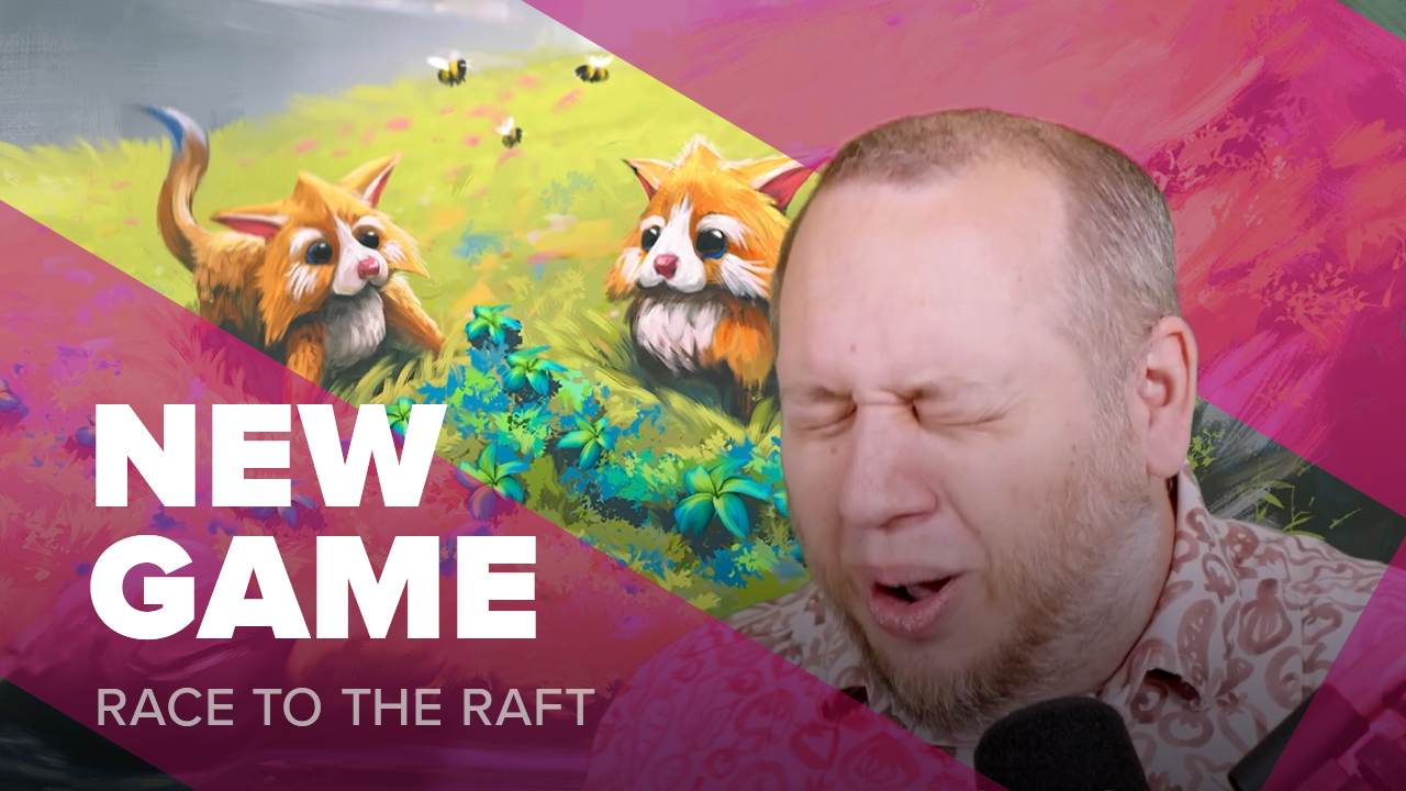
Across the range of images I can go from very formal to completely casual while keeping a much better level of consistency than I previously had. I’ve already started going over some of my old content updating it with the new style and hope to get the rest done soon.
I’m really pleased with the results and recommend spending a little time considering how you visually present your content across different channels.
Frank West
Frank West is a gamer and designer based in Bristol, UK. He published his first board game, The City of Kings, in 2018 and now works on other games and organising events in the local area. His goal? To design and publish games focusing on immersive themes, fun mechanics and beautiful components. If you have any questions or would just like a chat, feel free to get in touch at any time!

