5 lessons from the early days
I am currently in the process of reprinting the first two games I ever made, and while going through the files and looking at some samples, I’ve realised just how much I’ve learned since then. Publishing is a journey, and there are thousands of tiny things that can be the difference between a good and a great game. So, let’s take a look at five things that I’ve been thinking about this month.
1. What colour is that?
Colours are curious things. Many of us look at screens all day long without realising that the colour we are looking at is often defined by the device we are viewing it from. If you look at the same image on your PC monitor, phone, or TV, the colours will likely appear differently. Similarly, if you print that image and look at it on paper, it will look different depending on the quality of the printer, type of ink used, and paper it’s printed on. When it comes to board games, there are many different types of colours: the colour on screen, the printed colour on paper, and also the colours of plastic (dice/miniatures), wood (meeples), metal (coins), and other materials. It’s important to become familiar with different types of colours and to communicate with your factory about what colours are used for each material. You’ll want to get used to RGB, CMYK, and the various Pantone colour systems.
I’ve spent a lot of time over the years looking at a printed card in my hand and comparing it to the same image on my screen!
2. The side of the box
I’ve previously written about designing the side of the box and wanted to include it today as it’s something I keep coming back to. When I first started out, I spent considerable time thinking about the front of my box as it’s a key part of marketing, but I neglected the sides. The sides of your game boxes are likely to be the first thing most people see in a game store, and they really need to grab people’s attention so they check out your game. Over the years, I have redesigned the sides of my first three games in later prints and now pay far more attention to them.
3. Are they the same?
There is a lot of strange magic when it comes to printing, and I would be lying if I said I truly understood everything that goes on at the factory. However, it is safe to say that printing isn’t as simple as our home printers have led us to believe, and it is very possible for two identical things to look different if the machinery isn’t calibrated correctly. This is why some games suffer from the backs of their cards being different in different prints and expansions. One thing I’ve learned to do to help with this is to put matching items together on punchboards. Rather than having five punchboards with one green, two orange, and one pink piece on each, I now try to put all the green things on one, all the orange on another, and so on. This can help keep the colours of matching items consistent.
4. More than a game
It is easy to think of a game as the entire product when starting out. You commission artwork, icons, sculpts, and all the elements you need to make your game look perfect. You look joyously upon them when they start arriving in your inbox, and your game looks finished. It’s a great feeling! Then, over the following months, you realise you need to market your game. You might run a crowdfunding campaign, exhibit at conventions, or run online advertising. All of these things require artwork and should feel like they belong with your game. This means your graphic design needs to not only cover your game but also accommodate other uses. Artwork may need to be larger for convention banners, you may need additional layers of typography, or renders of models. It’s crucial early on to consider not just what the game needs, but also what you need in order to promote the game.
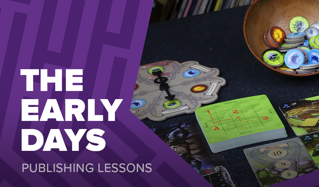
5. Spinners aren’t cool
I really like spinners, those little plastic arrows that clip onto a board, spin, and select something at random. For The City of Kings, I thought this would be a great way to visualise a clock in the game by having a spinner arrow that you slowly rotate each round to show time moving onwards. It would even be possible to spin it when certain effects take place to randomise the current time of day. However, it turns out I may be the last person on Earth who thinks spinners are cool. When you consider using an unusual component in a game, it’s worth doing some research to see how people perceive that type of piece.
Frank West
Frank West is a gamer and designer based in Bristol, UK. He published his first board game, The City of Kings, in 2018 and now works on other games and organising events in the local area. His goal? To design and publish games focusing on immersive themes, fun mechanics and beautiful components. If you have any questions or would just like a chat, feel free to get in touch at any time!
2 comments
JIMMY SMITH
19th May 2023 at 2:45 am
I think spinners are cool! 🙂
Frank West
19th May 2023 at 10:48 am
I’m glad to hear I’m not the only one!