Designing a board game publishers’ website
If you are a frequent visitor to this website, then you may have noticed it’s looking a little bit different today as I have been building a new experience for my visitors.
Up until now I have focussed too much on providing all the information anyone could ever want and assuming people are already familiar with my games.
The new experience is built around discovery, giving people reasons to discover new things, and making no assumptions about what they already know. I’ve tried to reduce the number of upfront options as much as possible while promoting key pages and frequently visited areas.
Game pages
Let’s take a look at the original game page for The Isle of Cats vs the new page.
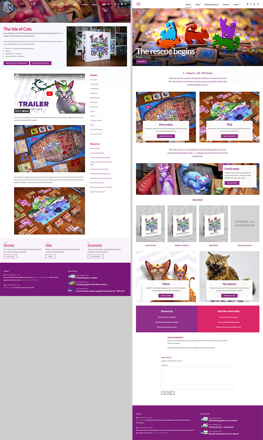
The original page was text heavy and gave little direction as to where to go next. It contained 28 links to other places and left it up to you.
The new page is far more visual and provides guidance based on the trends I have seen from visitors in the past 12 months. Over 50% of visitors go to either “How to play” or “FAQ” so I’ve raised those to the top of the page. The family mode, followed by expansions come next, so I have designed sections around these and other popular pages.
With a more visual guide, it also allows me to highlight sections like your photos. As a text link “your photos” doesn’t sound too exciting but the visual panel is far desirable to look at.
This structure also works nicely across each of my games allowing me to provide a consistent experience adding and removing sections as required.
Browsing games
A similar approach has been taken with other pages such as the games section.
Rather than listing all my game and providing lots of information upfront, I have stripped it back to guiding the user through imagery and short summaries.
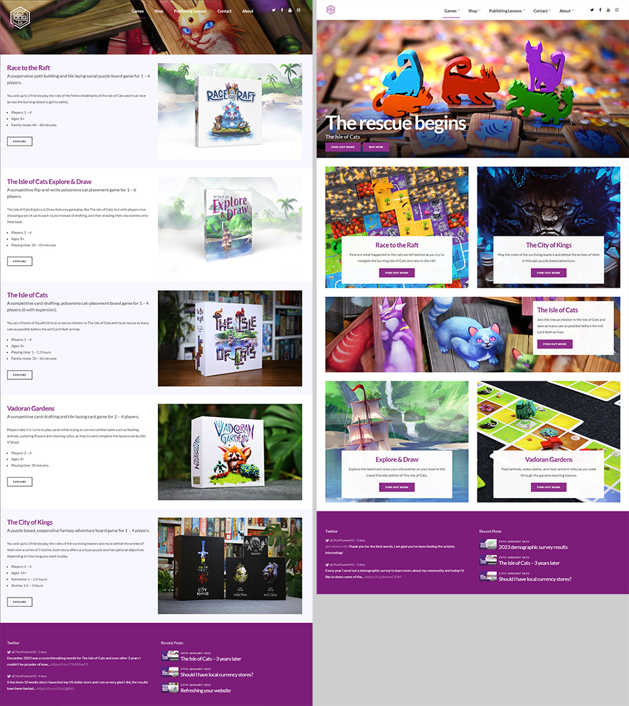
This greatly reduces the amount of effort required from the user to make a decision, and lets them discover new games in seconds.
Home page
Another big change across the website is moving away from using boxes to represent games and introducing artwork and gameplay shots.
This encourages the user to explore the worlds that look attractive to them and feels less like browsing a shop.
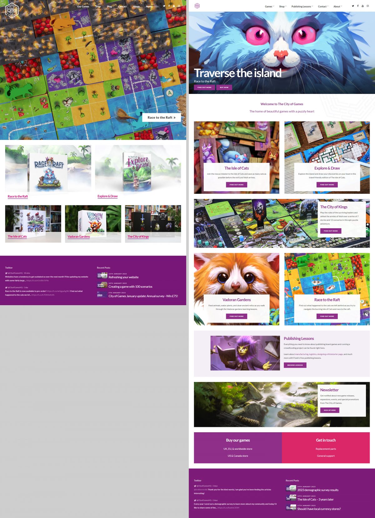
I’ve also expanded the home page to be more welcoming and promote other areas of the website (like this blog) and not just the games.
One of the great things about using artwork and gameplay shots is I can use different imagery on different pages making each area of the website feel fresh, and creating multiple opportunities for each game to grab a visitors attention.
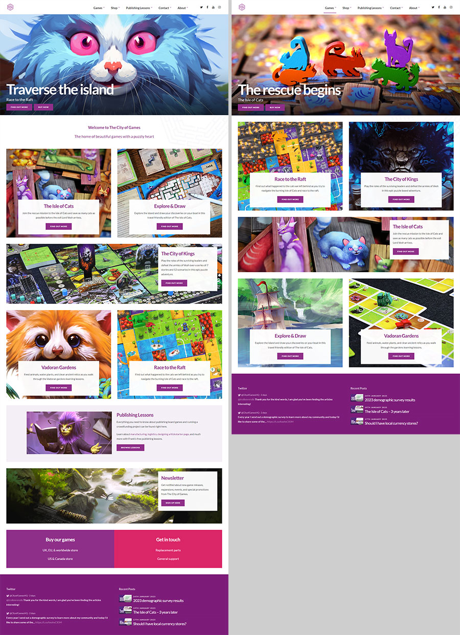
As you can see above, the home page (left) highlights my new game Race to the Raft while the games page (right) highlights my most popular game.
The order games are shown in is different and despite showing the same 5 games in the same 6 panels, the switch between artwork and gameplay makes both pages completely unique looking.
Comments
One feature which I wish I had introduced years ago and have now enabled is adding comments to most pages of the website. Allowing people to comment directly on game pages, FAQs, and how to plays.
If someone has a question that is preventing them from moving forward, it should be as easy as possible for them to get help. From now on anyone who visits my FAQs and doesn’t find the answer, will be able to post immediately without any extra steps.
Other changes
- I’ve restructured the websites main navigation to reduce the number of options presented upfront.
- I’ve relabelled many items in menus and links to be clearer, such as changing “blog” to “publishing lessons”.
- I’ve added social media links to the header.
- On many pages I’ve updated the copy to be more general and less specific, making it easier to understand for the wider audience.
- I’ve started standardising all the imagery to be the same style across different games (there is still more to do on this).
The next steps will be focused around improving key pages such as the how to play pages for each game and introducing better ways to navigate these articles.
I look forward to seeing the impact this new website has in the months to come!
Frank West
Frank West is a gamer and designer based in Bristol, UK. He published his first board game, The City of Kings, in 2018 and now works on other games and organising events in the local area. His goal? To design and publish games focusing on immersive themes, fun mechanics and beautiful components. If you have any questions or would just like a chat, feel free to get in touch at any time!

